
As a student, I wanted to be a journalist. I wrote for my high school newspaper and yearbook. In college, I swallowed newspapers whole and studied under writers from the Philly Inquirer and the Washington Post. I worked with the best of ‘em. But across all of my experiences as a writer, there was one common phrase that leveled the playing field of expertise: above the fold.
Above the fold is that prime real estate (pun intended) of the coveted newspaper on the upper half of the first page. It’s where your story goes if it’s important. As a beat reporter at The Daily Pennsylvanian, I woke up early in the morning and ran to the closest newsstand to see if my story made the front page. If your story was above the fold, you were golden. You were the first thing readers saw when they picked up the paper, and you partly determined if they were interested enough to open the rest of its pages.
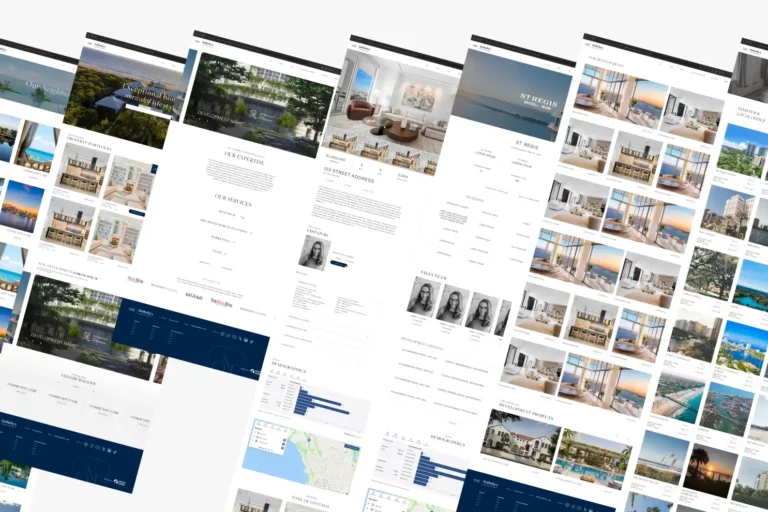
As I moved into the Internet marketing world, I realized that this concept carries over. Websites are, in a sense, virtual newspapers. Your homepage is the front page. Everything within a user’s immediate field of vision after landing on your real estate website’s homepage is above the fold. The content and design of this section of your website are important for business. However, it is not the be-all, end-all of your site’s success. Some marketers swear by the fold. Others say the fold is dead and offer research that shows why the fold is a myth.
I’m here to offer another perspective: like most things, the success of the fold is about balance. Don’t cram every possible piece of information about your company into 600 by 600 pixels; users know how scrolling works, and they’ll use it if they want to. Conversely, don’t treat the above-the-fold section like any old page on your website. Your homepage should tell a story to your clients and lead them easily through the entirety of your site. Ideally, an explanation of your business’s primary focus should sit above the fold. You might even offer a call to action above the fold – although we’ll talk about that more below.
Here’s the gist: if the content and design above the fold are good, potential homebuyers and sellers will be more likely to venture into the deeper pages of your site – like property search pages and contact pages. If the content and design above the fold are bad, then those same potential clients might just hit the back button and return to their search – making your bounce rates rise. So how do you entice your clients with such a small space? Thankfully, the solutions are simple enough.
Keep reading to discover our tips for enhancing your real estate website’s homepage.
How to Enhance Your Real Estate Website’s Homepage
- Have an organized design
- Write clear, concise, copy
- Include an easily visible navigation
- Display your logo and mission statement
- Incorporate engaging images
- Add a call to action
1. Have an Organized Design.
First thing first: make sure that the design and content of your homepage are organized. Have you ever looked at a complicated map or instruction manual and wanted to give up? That’s what it feels like to be on a website with poor navigation. Accessible user navigation is an essential component of website organization, everything should have a designated and easy-to-locate place (more on the navigation below). Cut out the graphic clutter. Clean boxes that display your site content will make your website more legible and easier to navigate. Your homepage should be the easiest part of your site for users to interact with. Users don’t want to be overloaded with information, instead have it easily accessible.
2. Write Clear, Concise Copy.
Clear copy wins at the end of the day. Whether you’re writing about your latest listing or your company’s mission statement, make sure that the language is straightforward and easy to read. Site visitors don’t have much patience when it comes to sorting through information. They choose the path of least resistance. Guiding your visitors to your call to action through clear, above-the-fold content will lead to better business and more conversions.
3. Include an Easily Visible Navigation.
When visitors first land on your homepage, they will make split-second judgments about how likely your site will answer their needs. Place a navigation bar at the top of the page so that it’s easily visible above the fold. The navigation bar serves as a sneak peek at the rest of the content on your site, and users will be more likely to visit the inner pages of your website if the navigation bar is easily accessible.
4. Display Your Logo and Mission Statement.
Your site visitors want to know who your company is and what you’re about. Once a visitor lands on your homepage, they want to know that they aren’t wasting their time. Do you sell land property in northern Maine, or do you deal exclusively with beach rentals in North Carolina? Feature this information prominently so your potential clients know they’re in the right place.
5. Incorporate Engaging Images.
Because real estate is a heavily visual industry, choose images for your homepage that will interest your visitors. Best way to go? Images that are action-centric and focus on the product or service that your company provides. Are you a real estate agent? Pick a photo of yourself hosting an open house. Are you a horse wrangler? Find a photo of you riding bareback on a horse.
6. Add a Call to Action (CTA).
The placement of a call to action is probably one of the most disputed topics in real estate website design and web design in general. For a while, placing a CTA anywhere below the fold was considered blasphemy. Now, the facts are a little different. Placing a CTA in multiple places on a homepage will increase the chances of users seeing it. The key is to try and test multiple placements for your CTA and always go back to the data to strategically place your CTAs.
It’s important to keep in mind that not everything on this list needs to be above the fold on your homepage consider how it could be found within the website, too. Take a step back and consider the whole picture. The overall design of your website should be clear and easy to figure out at first glance.
Interested in a new real estate website? Reach out today or take a look at some of our award-winning real estate website designs.