What is UX Design?
User experience (UX) design is the process of facilitating a successful, efficient and enjoyable relationship between the customer and the product or service. This process is responsible for those moving walkways in the airport, it’s why you’ll find the coat hanger on the wall in the mudroom, and it’s the reason McDonald’s uses the two-window drive-through system. UX design is why people don’t Blockbuster and Chill.
While the practice of UX design has existed for centuries, the modern connotation refers to the relationship between end users and digital products, like websites, software, and mobile applications.
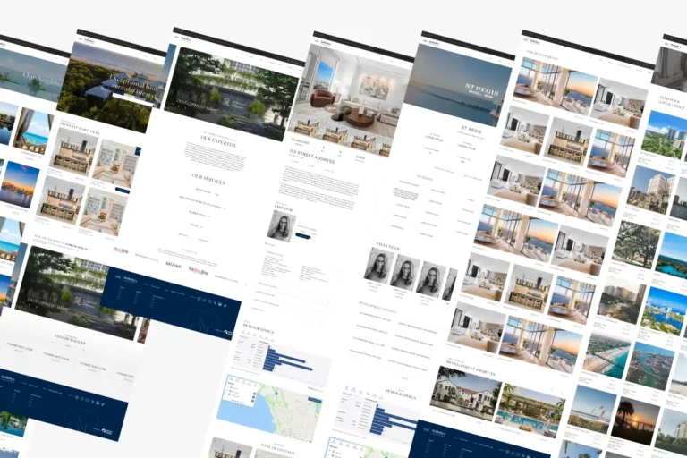
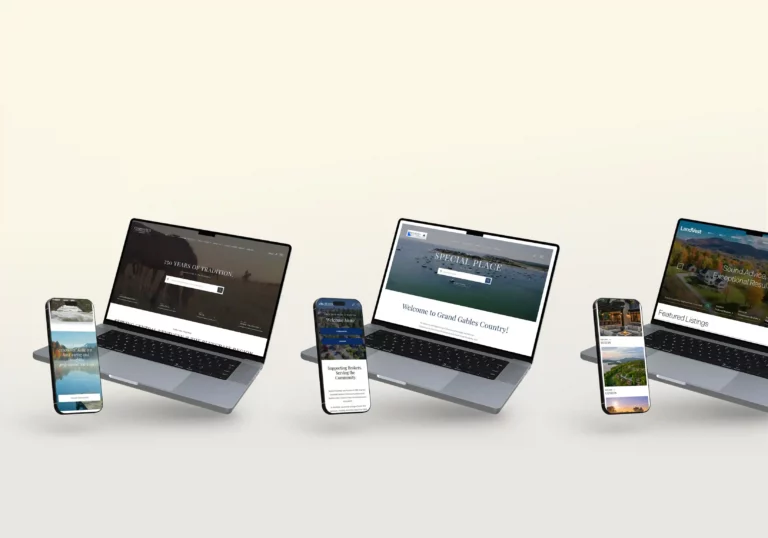
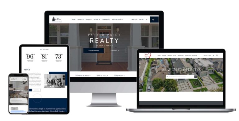
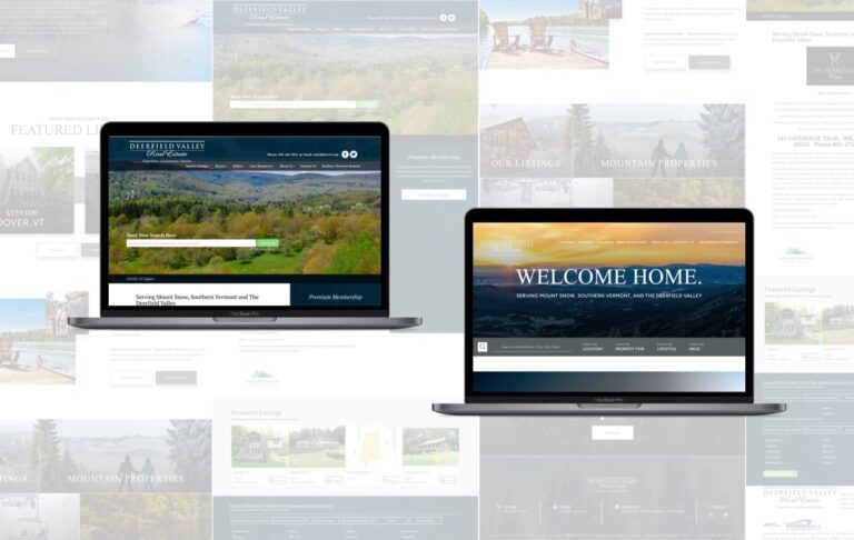
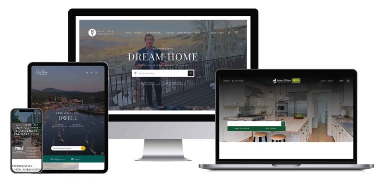
At Union Street Media, we use superior UX design to connect real estate professionals to their clients. The front end of our platform allows homebuyers and sellers to explore properties and conduct market research, while the backend helps agents and brokers manage leads, publish content, and develop their brand.
5 Keys to Great UX Design:
1. SEO
Search engine optimization (SEO) is a crucial component of online marketing and UX; users will never be able to experience your site if they cannot find it. Fortunately, many best practices for UX design overlap with best practices for SEO.
SEO is a complex and ongoing process, but here are some of the most important ways to help search engine users find your site:
- Optimize your title tags and page headers with highly targeted keywords specific to the content on each page.
- Audit crawl errors using a search engine monitoring tool, like Google Search Console for example, and set up 301 redirects as needed.
- Build external links. Quality external links (links pointing to your site from another reputable site) are one of the most impactful ways to build authority. Moz explains the importance of external links here.
2. Flip the Pyramid
Although the homepage is often the most trafficked landing page, the majority of users are still entering the site from secondary or tertiary pages. This is especially true for e-commerce sites because many users have a specific product in mind before they reach the site.
For our clients, about 75% of website sessions began on a page other than the homepage. So, your site needs to be easily navigable from every page in the sitemap. It is widely considered best practice to use a consistent main navigation, header and footer across all pages of your site.
Some designers make the mistake of thinking of their site as a pyramid, with the user entering the site at the top and then branching out to other pages as they progress through the site. This is alright if you are designing a general interest website, but if your goal is to capture leads or make sales, it’s better to flip that pyramid on its head. The site should funnel visitors towards a conversion regardless of where the user path begins.

3. Use Local Navigation
“Local” navigation refers to navigation items that pertain to the content on a particular page, as opposed to primary, or global, navigation items which allow a user to jump to an entirely different section of the site.
The graphic below helps illustrate the relationship of the various navigation items on a website and how the user differentiates among them.

Filters are one of the most common forms of local navigation. For product list view pages, like our clients’ recommended search pages or a retail page like the Nike example below, users should be able to narrow down the selection using a series of relevant filters. The belief with local navigation is that the user should feel as though they are operating within a certain section of a website, rather than across the entire site.

In real estate, we have found that the most popular filters include Price, Property Type (or Style), and Location. Category and sub-category menus on blog or news site are another example of local navigation.
4. Give the People What They Want!
Regardless of your industry, there are a few things that users have come to expect from a website. For instance, company information like phone number, address and email should be accessible on, or within one click of, the homepage. Users expect Contact or Customer Service links to be in the top right section of the web page either in the main navigation or header.
We also know that users expect the company logo at the top of a page to link to the homepage. For mobile icons, the magnifying glass for search, house for the homepage, and the ‘hamburger’ menu are the most ubiquitous navigation items.
![]()
As the case with any set of best practices, there are instances in which it is acceptable to break away from the norm, but make sure you have a good reason (and some convincing data) to back the decision.
5. Testing. Testing…
Don’t let the word “design” mislead you — UX design is more science than art, which means market research and data analysis are crucial. There are dozens of free and paid tools available to digital marketers to evaluate the ways users are finding and interacting with your site. At Union Street Media, we aggregate user data from a wide range of sources and this information plays a pivotal role in our clients’ strategy.
Avoid making UX decisions based purely on gut or intuition. Just because an element “looks right” or “makes sense” to you, doesn’t mean that an end user will react the same way. A/B testing is a great way to experiment with design options, just remember to be patient and give the data time to aggregate.