
John R. Wood Christie’s International Real Estate
Let’s do an overview
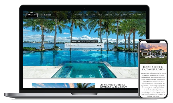
This design is the intersection of defined branding and an immersive user experience. With organized branding guidelines provided by the client, we created an informative, intuitive experience for users that sets them apart from competitors in their area.
Video tour of the site
John R. Wood Christie’s International Real Estate
Home to Southwest Florida’s top-performing real estate experts who connect buyers with luxury homes in their unique and competitive property market.
Some things we’re proud of

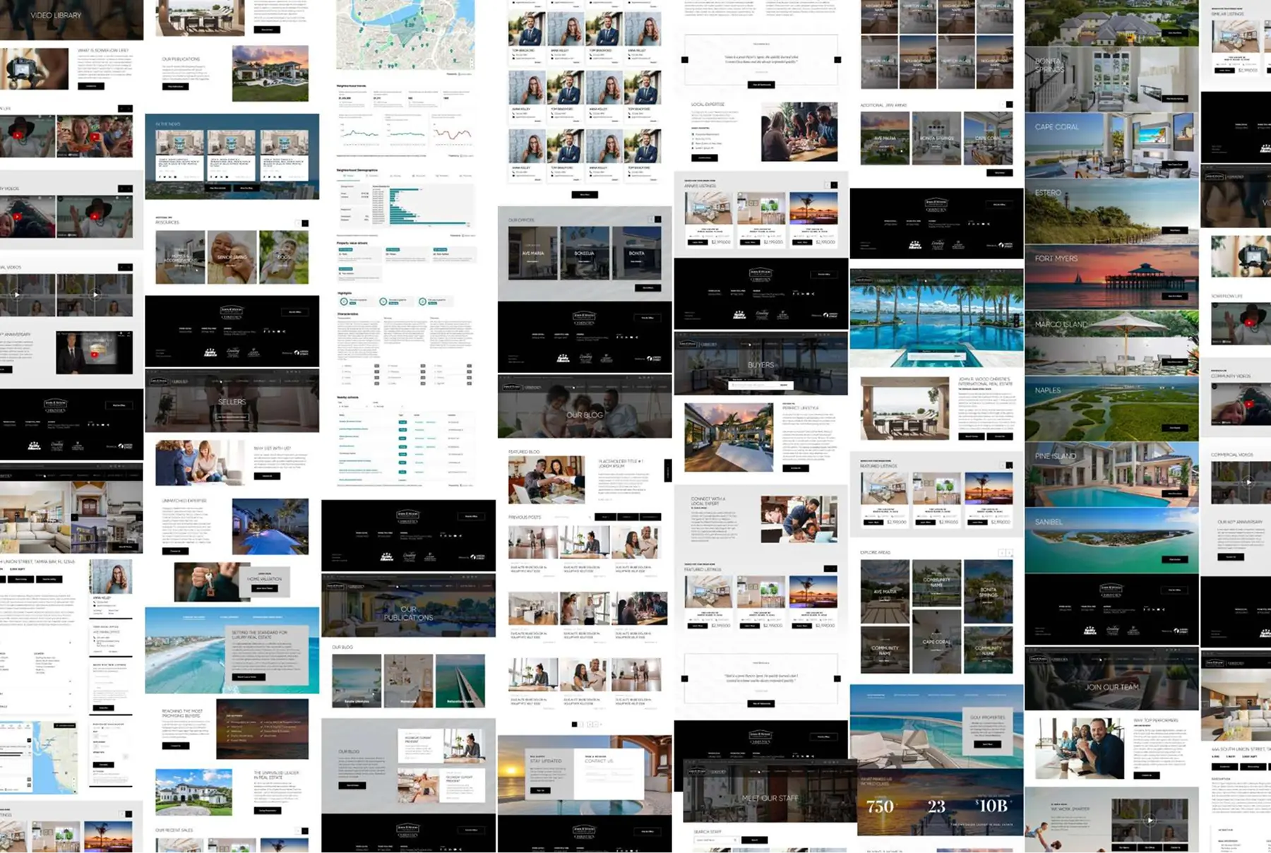
Customizing Careers
Using a custom careers page, we were able to represent why agents would want to join the John R. Wood Christie’s International Real Estate team.
With a plethora of video content to showcase, potential applicants are able to hear from the team from the very beginning.
With a plethora of video content to showcase, potential applicants are able to hear from the team from the very beginning.
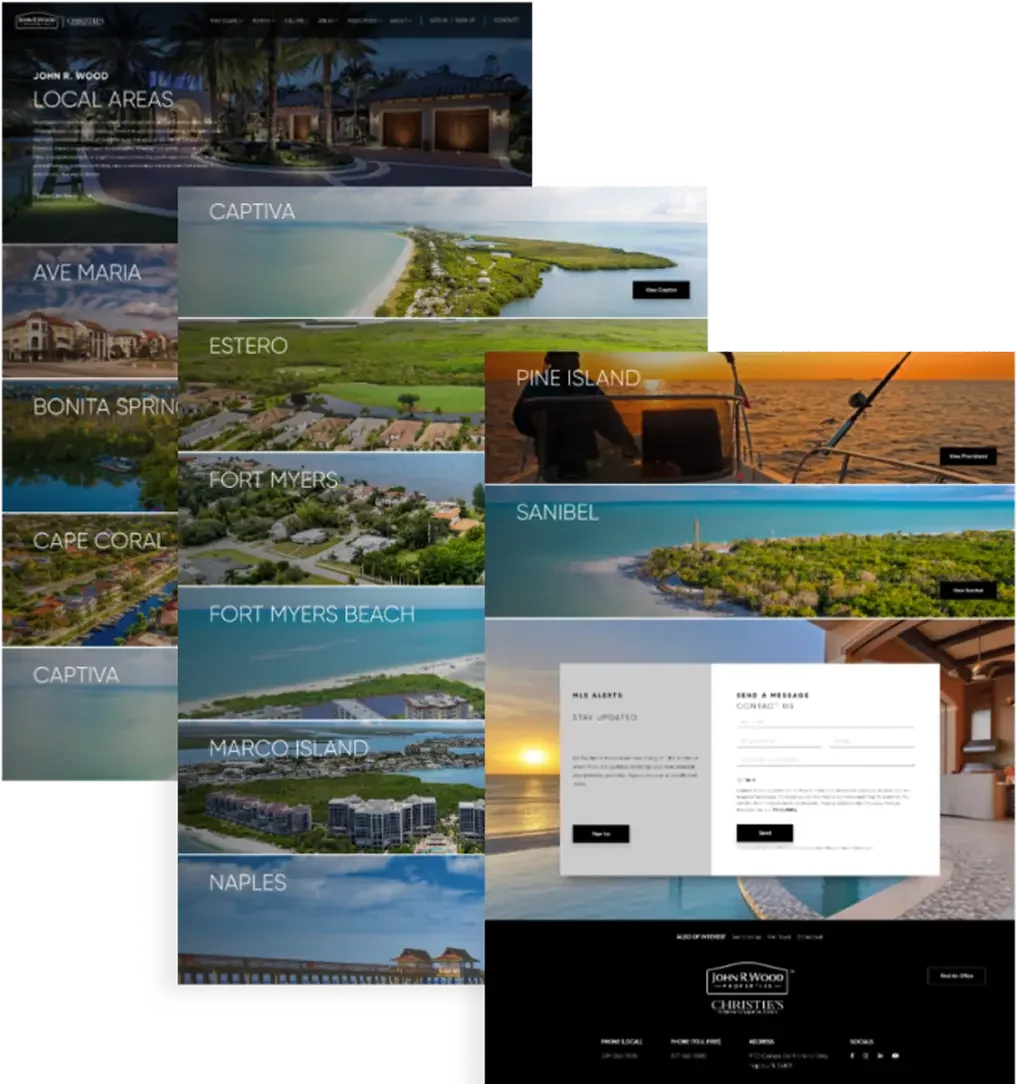
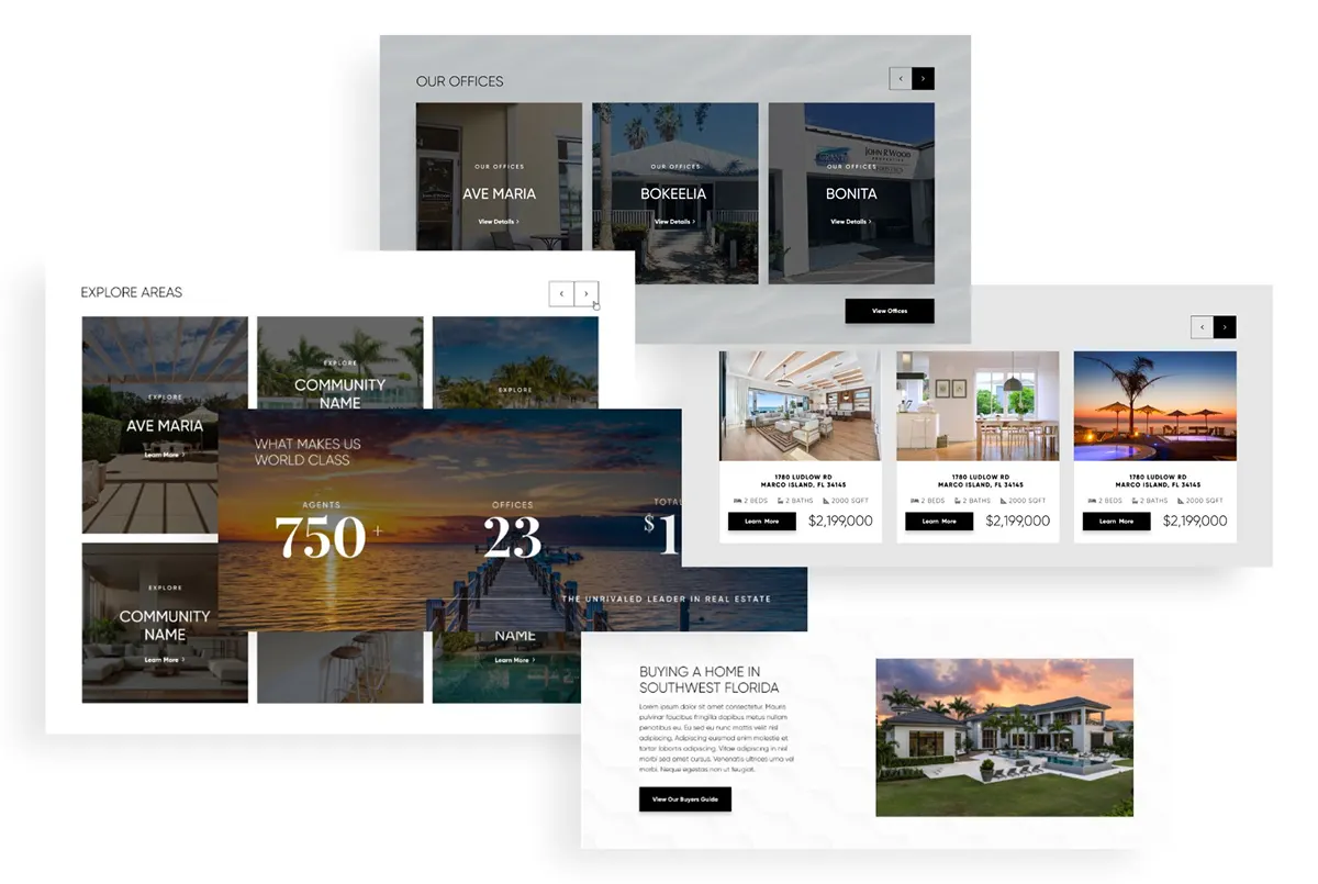
Local Areas
With the wide range of service areas that John R. Wood Christie’s International Real Estate agents cover, it was important that local areas and individual neighborhoods within them were a focus on the website.
Individual area page designs were used to give each neighborhood and area its own spotlight, detailed with stats from Local Logic.
Individual area page designs were used to give each neighborhood and area its own spotlight, detailed with stats from Local Logic.
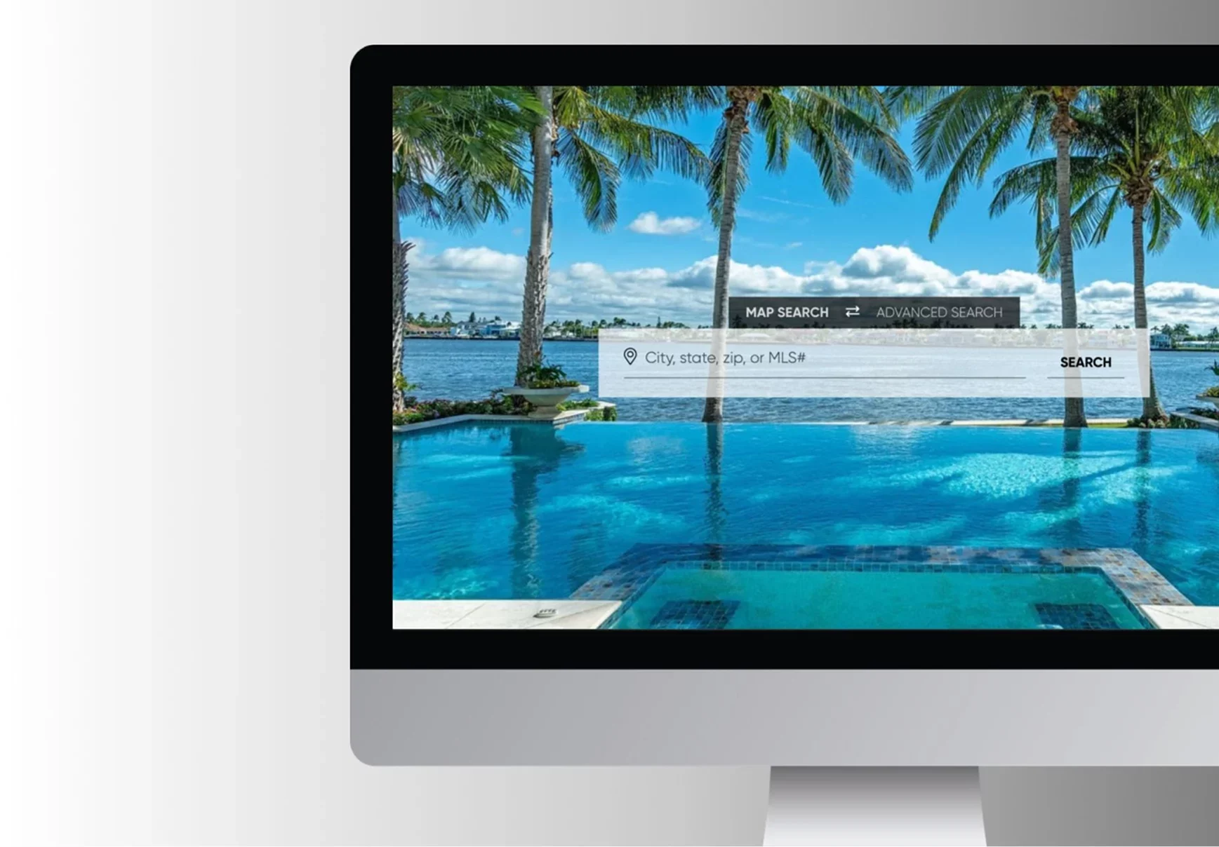
Tailored Search
To centralize the search experience, John R. Wood Christie’s International Real Estate has a custom search bar that uses natural language search upon site load, with the option to switch to an advanced recommended search bar at the user’s choice.
A sticky search bar in the navigation allowed for the user to search at any duration of their site experience as well.
A sticky search bar in the navigation allowed for the user to search at any duration of their site experience as well.
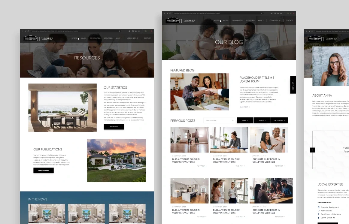
Detailed Branding
Using John R. Wood Christie’s International Real Estate’s defined branding, with a color palette of black, grey, and white, the team added depth to the site with texture and geometric shapes.
The contrast of light and dark is not only seen through text and background usage, but also through the use of high-definition photographs and CTA treatment.
The contrast of light and dark is not only seen through text and background usage, but also through the use of high-definition photographs and CTA treatment.
Customizing Careers
Local Areas
Tailored Search
Detailed Branding
Step 1
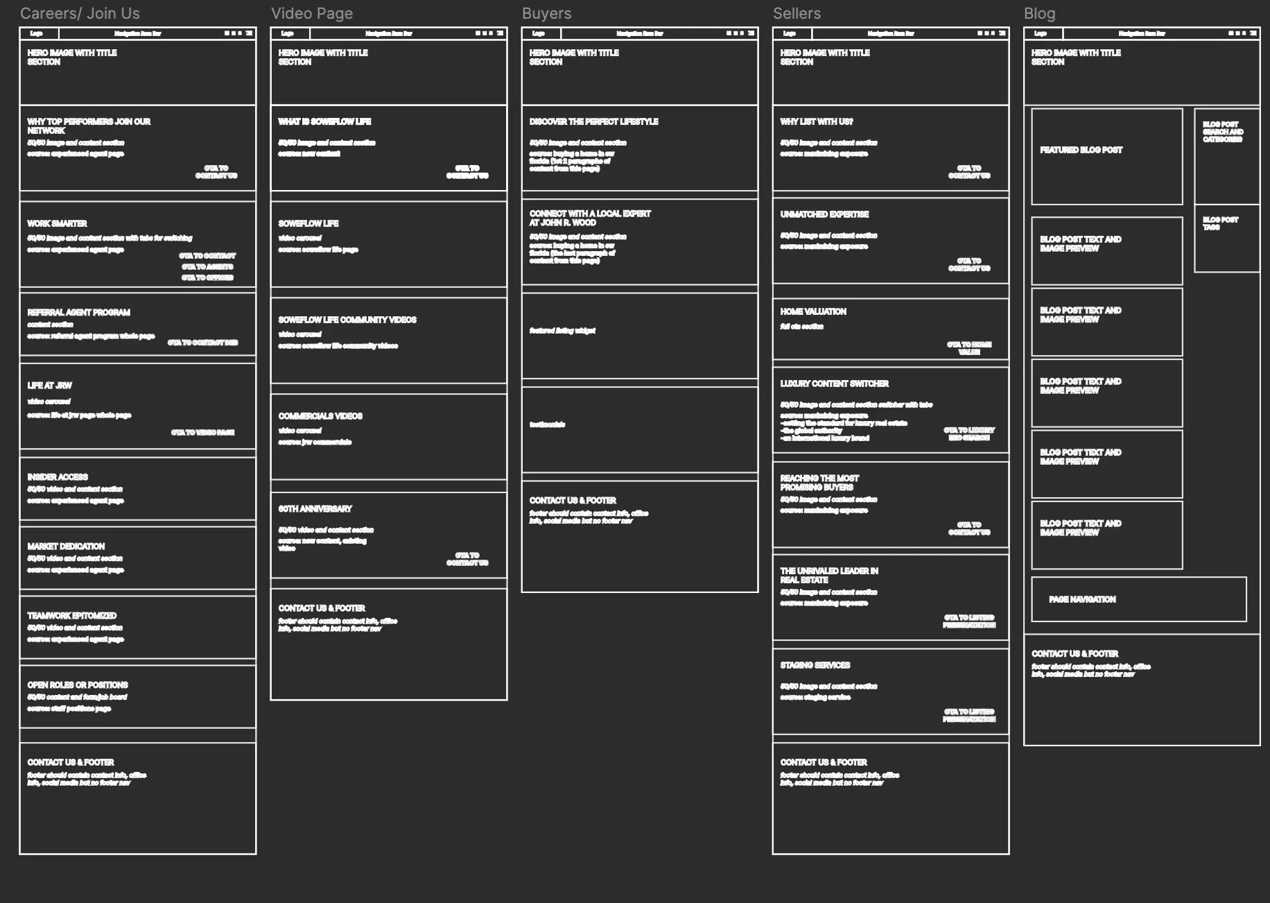
Beginning this project with wireframes allowed our team to map out the content that would be on the site and what pages it would live on. It gave the John R. Wood Christie’s International Real Estate team the opportunity to move things from page to page, and create new content if needed.
Step 2
Once the wireframes are signed off, we move into the design phase, where we bring to life the vision we discussed on the kickoff call and our brand guidelines to stay consistent and aligned with their company.
Step 4
Once the site has been launched, our team prioritizes quality assurance to ensure a seamless user experience.
Through QA processes, we are able to identify and fix any bugs and address any post-launch needs.
Through QA processes, we are able to identify and fix any bugs and address any post-launch needs.